Typography
Primary typeface
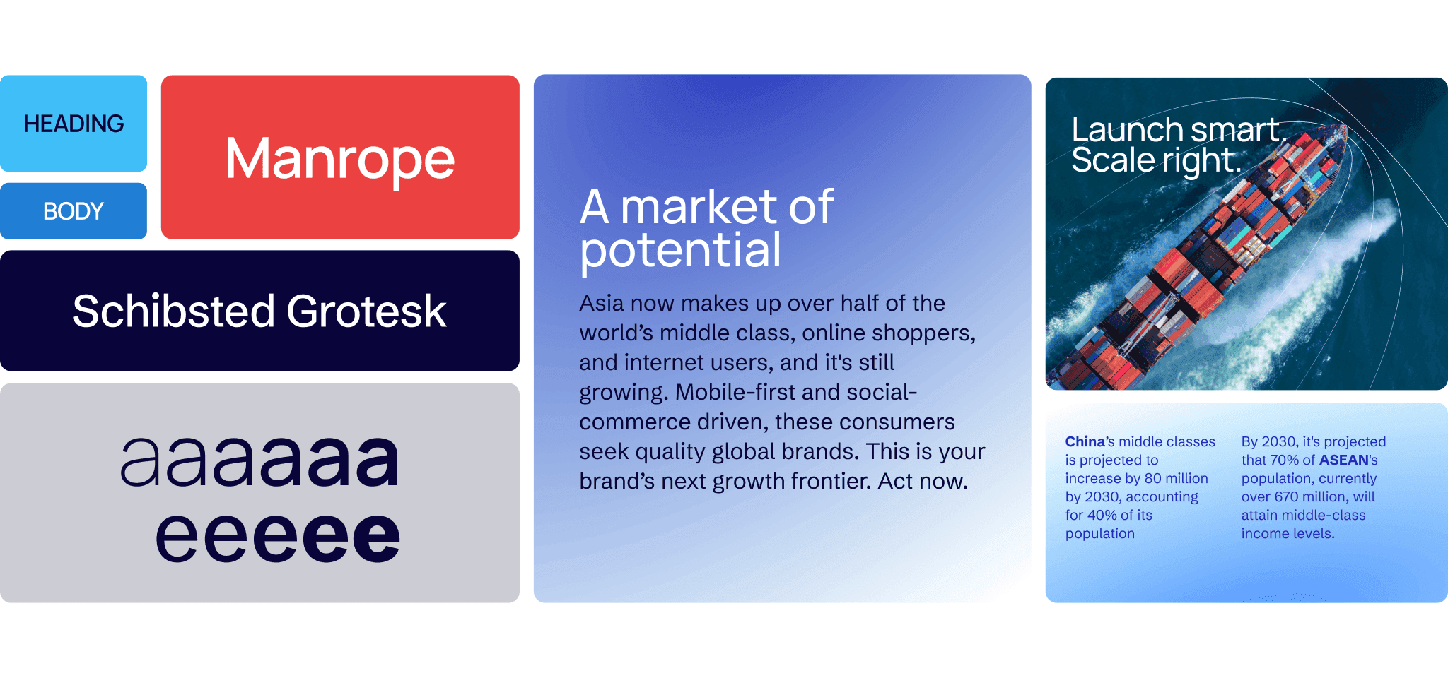
Our primary typeface for headings is Manrope, a modern, open-source sans serif typeface designed by Mikhail Sharanda in 2018. Manrope strikes a fine balance between approachability and authority, thanks to its clean geometric structure softened by subtly rounded corners. This fusion of friendliness and strength makes it especially effective for headings, drawing attention with clarity and impact, while maintaining a contemporary and professional tone.


Secondary typeface
Our secondary typeface for body text is Schibsted Grotesk, another contemporary, open-source sans serif typeface. While inherently modern, it draws visual inspiration from Schibsted’s legacy in print media, blending tradition with forward-thinking design. Schibsted Grotesk was crafted to serve as a versatile brand asset, supporting clear communication, enhancing readability, and connecting audiences across both internal and external platforms. Its high legibility makes it an ideal choice for Asia Circles to present information-dense content with clarity and ease.


Leading
Leading in typography refers to the vertical space between lines of text, measured from baseline to baseline. Proper leading ensures that lines are comfortably spaced, neither too tight, which can make text feel cramped and hard to read, nor too loose, which can disrupt the reader’s flow. Leading establishes hierarchy, improves legibility and visual harmony, and creates a more inviting reading experience.
Leading for primary typeface
When used for headings, Manrope benefits from tighter leading to enhance its bold, structured appearance and create a strong visual impact. Since headings are typically shorter and designed to grab attention, reduced vertical spacing between lines helps maintain a compact, cohesive look. For optimal clarity and aesthetic harmony, we recommend setting Manrope’s leading at approximately 95–105% of the font size when used in multi-line headings, adjusting as needed based on layout and scale.

Avoid loose leading
Overly loose leading creates a lack of cohesion, making the text feel disjointed.
Aim for closer leading
Tighter leading unifies the lines, making them feel like a cohesive element.
Leading for secondary typeface
When used for body text, Schibsted Grotesk requires generous leading to ensure comfortable readability, especially in information-dense layouts. It's clean, open letterforms perform best with slightly increased vertical spacing, allowing each line of text to breathe. For optimal legibility, we recommend setting the leading at approximately 130–140% of the font size.

Avoid too loose or too tight leading
Excessively loose leading disrupts visual continuity, resulting in a fragmented reading experience, whereas overly tight leading causes lines to feel cramped, hindering readability and making the text harder to scan.
Leading with the right amount
Appropriate leading improves readability, strengthens user experience, and reflects the clarity and professionalism of Asia Circles’ brand communication.
General spacing
Spacing is key to creating hierarchy and clarity: elements that are related should be placed closer together, while unrelated items should have more space between them. This principle of proximity helps viewers quickly understand the relationships within the content, guiding their attention naturally through the layout. Proper use of spacing not only groups information logically but also creates visual balance, making the design easier to read and more engaging.

Similar spacing everywhere
Uniform spacing hinders the reading process by making it difficult for readers to distinguish between headings and body text. This lack of visual proximity also impedes quick scanning, as the consistent spacing blends all elements together.
Different spacing for different purpose
The subtitle ties directly to the title, while body headings relate closely to their content. Grouping them separately with added space creates a clear, effective hierarchy that guides the reader effortlessly.
Hierarchy
Typographic hierarchy is the intentional arrangement of text elements to guide the reader’s eye and convey the relative importance of information. By varying font size, weight, color, spacing, and style, hierarchy establishes a clear visual structure that enables quick scanning and easy comprehension. Use the different weights and sizes of Manrope for headings and Schibsted Grotesk for body text to create a strong, functional hierarchy.

Fallback typeface
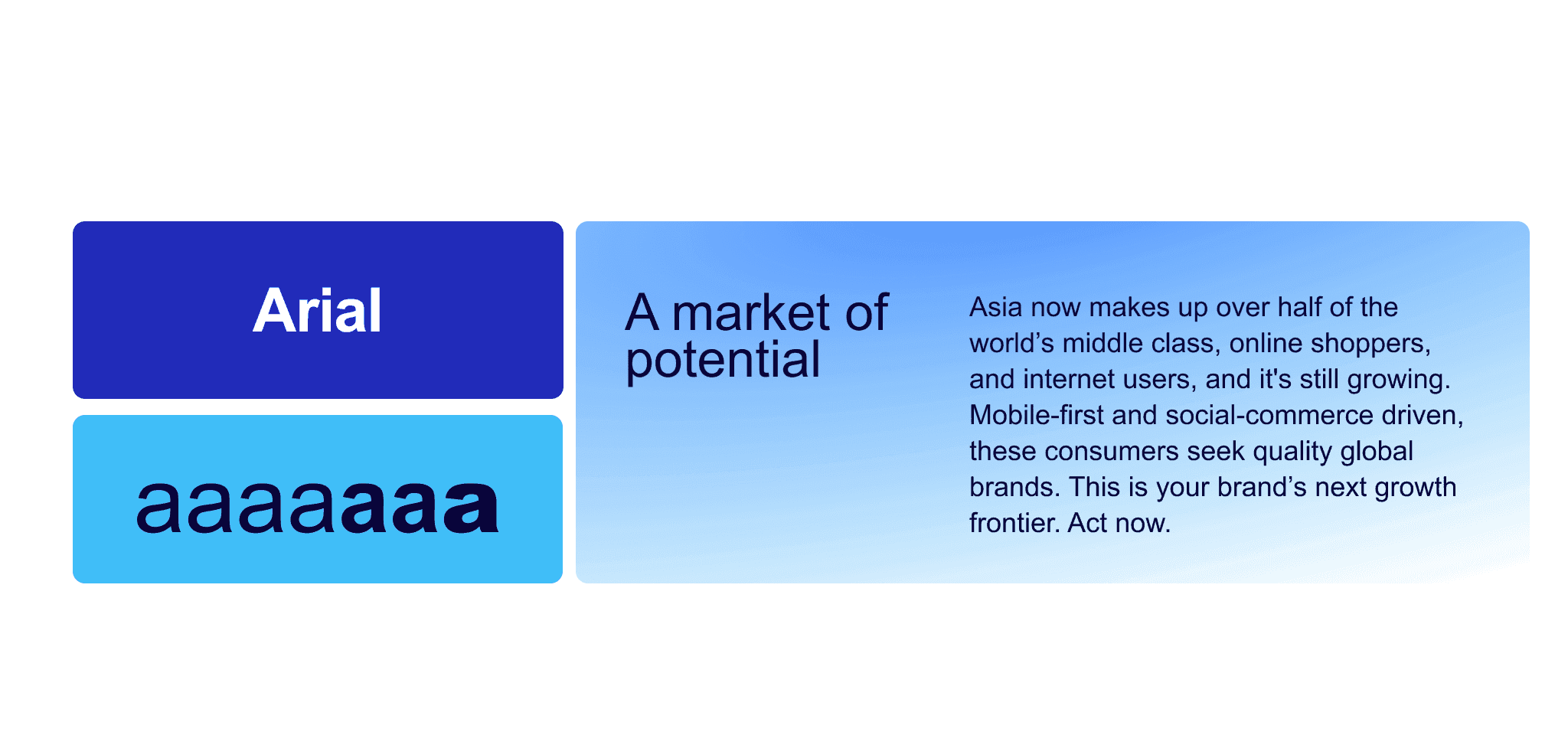
In situations where our primary or secondary typefaces may not be available, Arial serves as the reliable fallback font. Arial is a widely supported, sans-serif typeface known for its clean and neutral design. While it lacks the unique character of Manrope or Schibsted Grotesk, Arial ensures consistent readability and maintains a professional appearance across virtually all devices and platforms. Its widespread availability makes it an essential safeguard for preserving the integrity of our brand’s typography in diverse technical environments.
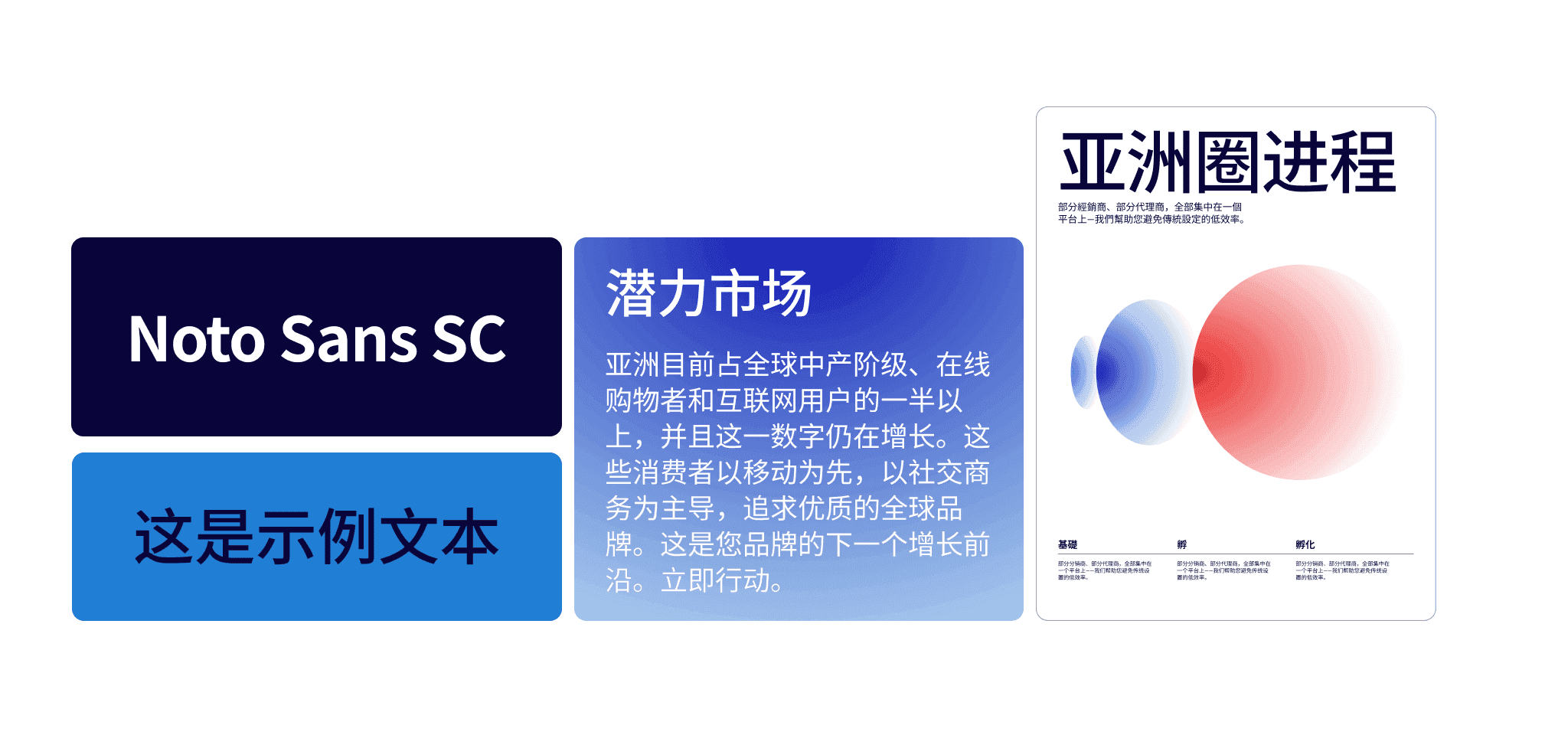
Chinese alternative typeface
For the Chinese market, we use Noto Sans SC (Simplified Chinese) as our alternative typeface. This modern, open-source sans serif typeface offers excellent legibility and pairs harmoniously with our Latin typefaces. Noto Sans SC ensures our brand communications remain clear, accessible, and culturally appropriate for Chinese-speaking audiences while subtly preserving our visual identity.