Graphic Systems
Our graphic systems reflect how we help partners unlock their potential and scale sustainably, through a system rooted in strategy and adaptability.
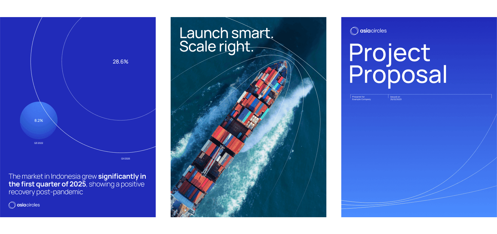
Fluid, overlapping gradient forms
This motif captures the idea of resonant growth through fluid, overlapping gradient forms that radiate outward. As a visual metaphor, it reflects Asia Circles’ values of helping brands scale with intention, direction, and regional insight.


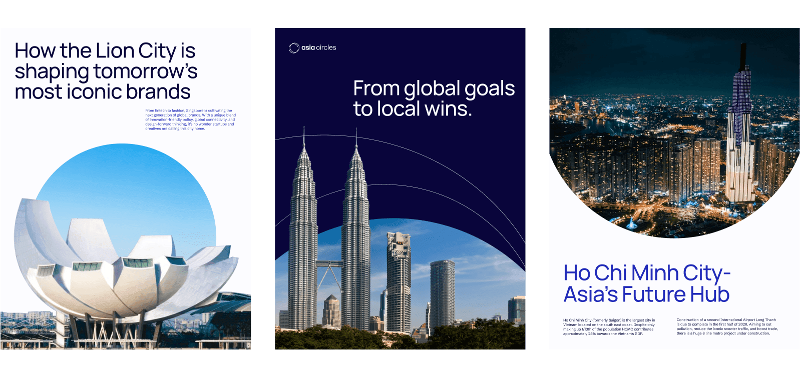
Expanding line arcs
This secondary motif uses expanding lines as the main component. Inspired by navigational paths and wave patterns, these arcs represent how Asia Circles leads brands with clear strategies and directions.
Round image frame
Using round image frames - circular shapes, a universal symbol of wholeness- the presented images mirror the interconnectedness and holistic approach at the heart of Asia Circles' strategic framework.
The baseline
Subtle lines run beneath the design, quietly holding each element in place. They symbolize the intentional structure behind Asia Circles’ every move, reinforcing the brand’s role as a dependable and deliberate support system.

